Categories
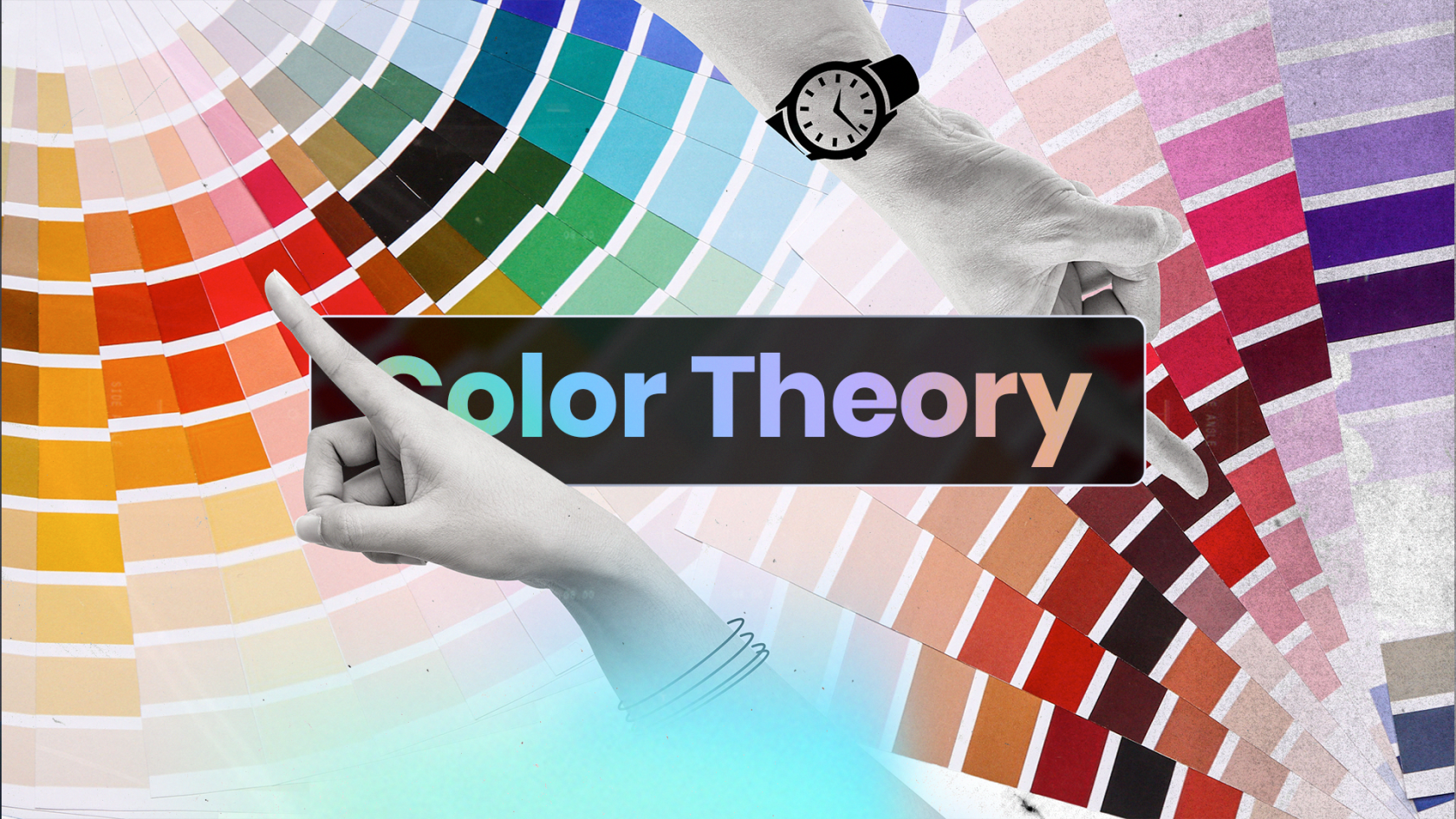
The Importance of Color Theory in Design
In the design world, color is an essential element that can make or break a project. The colors used in a design can convey different emotions and moods, and can even affect how people perceive a brand or product. This is why understanding color theory is crucial for designers.
Color theory studies how colors interact with each other and the human eye. It involves understanding the science of color perception, including how colors are created, combined, and interpreted. The color theory also explores the psychological effects of different colors and how they can be used to create specific moods and emotions in a design.
The Psychology of Color
Colors have the power to evoke emotions and feelings in people. This is why color psychology is an important aspect of color theory in design. Understanding the psychology of color can help designers make informed decisions about the colors they use in their designs.
1. Red
Red is a warm color that is typically associated with passion, energy, and excitement. It can also be associated with danger or warning. In design, red can be used to draw attention to important elements or create a sense of urgency.
2. Blue
Blue is a cool color that is often associated with calmness, trust, and professionalism. It can also be associated with sadness or melancholy. In design, blue is commonly used in corporate branding and business designs.
3. Yellow
Yellow is a warm color that is typically associated with happiness, warmth, and optimism. It can also be associated with caution or warning. In design, yellow can be used to create a sense of cheerfulness or playfulness.
4. Green
Green is a cool color that is often associated with nature, growth, and health. It can also be associated with envy or greed. In design, green is commonly used in environmental or health-related designs.
5. Purple
Purple is a cool color that is typically associated with luxury, creativity, and royalty. It can also be associated with mystery or spirituality. In design, purple can be used to create a sense of elegance or sophistication.
6. Orange
Orange is a warm color that is often associated with energy, enthusiasm, and warmth. It can also be associated with caution or warning. In design, orange can be used to create a sense of excitement or playfulness.
7. Pink
Pink is a warm color that is typically associated with love, romance, and femininity. It can also be associated with innocence or sweetness. In design, pink is commonly used in advertising or marketing designs targeted toward women.
8. Black
Black is a cool color that is often associated with sophistication, elegance, and power. It can also be associated with darkness or negativity. In design, black is commonly used in luxury or high-end designs.
9. White
White is a cool color that is typically associated with purity, innocence, and cleanliness. It can also be associated with emptiness or lack of emotion. In design, white is commonly used in minimalist or modern designs.
10. Gray
Gray is a cool color that is often associated with neutrality, stability, and sophistication. It can also be associated with boredom or sadness. In design, gray is commonly used in corporate or business designs to create a sense of professionalism.
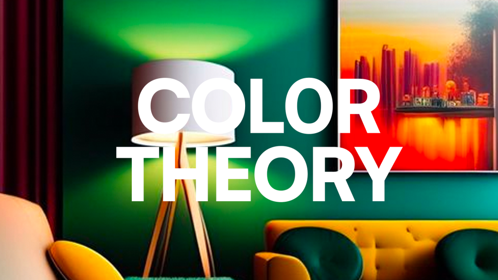
Using Color to Convey Emotions and Moods
Colors can be used to convey different emotions and moods in a design. For example, warm colors like red, orange, and yellow can create a sense of energy and excitement, while cool colors like blue and green can create a sense of calmness and relaxation.
Designers can also use color contrasts to create visual interest and draw attention to specific elements in a design. For example, pairing complementary colors like blue and orange can create a striking contrast that catches the viewer’s eye.
In addition to color contrasts, designers can also use color harmony to create a cohesive and visually appealing design. Color harmony involves using colors that are related to each other on the color wheel, such as analogous colors or triadic colors.
Conclusion
Color theory is an essential aspect of design that can have a significant impact on how a design is perceived. Understanding the psychology of color and how it can be used to convey different emotions and moods is crucial for designers. Using color contrasts and harmony, designers can create visually appealing designs that evoke specific emotions and moods. So, the next time you start a design project, remember the importance of color theory and how it can enhance the effectiveness of your design.
If you need any help along the way, our team of experienced creatives is always here to offer guidance and feedback. Together, we can create truly amazing work that stands out from the crowd.